
Architecture: not only shapes but colours too
Colours as emotion and soul of spaces
In his system named "Architectural Polychromy", the great Le Corbusier studied and defined 63 different shades for the design of colour in architecture; he subsequently organised them in "a system", according to their shades, harmony, and their possible infinite combination modalities. Obviously, each shade and each combination represent a specific strategy for the development of the space, and how the human being will perceive it.
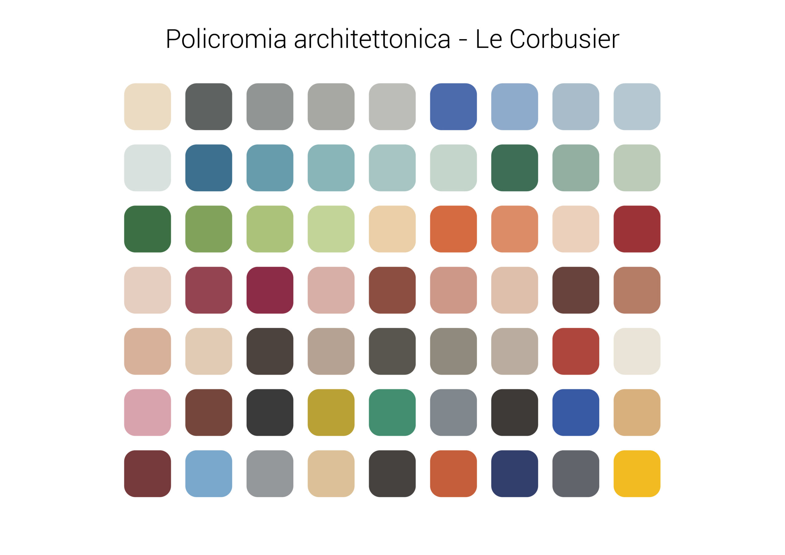
Starting from this assumption, it is clear that the colour belongs to our daily life and has an important place in our perceptive world and in that of our emotions, affecting our moods. The ability to know how to use the different colours is a purely human prerogative, and only the monkeys have a similar skill in the animal environment. Colours have always had a central role in the evolution of mankind, as they are perceived by the human brain which processes them, and subsequently judges them on both an objective and a subjective base.
Objective criteria are the result of the surrounding reality, the colour rendering according to the place, the natural and artificial light, the furnishings and much more. For example, if a room is oriented to the North, it will certainly have less lighting; it is therefore preferable to use warm colours for its walls, such as yellow or orange. Another objective criterion is the depth and spatiality of environments based on the brightness: lighter colours tend to envelop the environment, while dark ones tend to remain in the background.
Subjective criteria are the emotional ones that everybody consciously or unconsciously perceives. In general, warm colours are friendly and embracing, while cold colours are minimalist, clean, and linear, symbolising safety and calmness.
Therefore, the colour has a particularly important role in both working and living environments, underling not only the beauty of a space but also its perception. The colour moves according to biological reactions, as it is directly connected to the energy frequencies corresponding to its different light waves. In general, colours have the same perception across the world and the exceptions are purely of cultural nature: for example, the white colour represents everything that is desirable in the West, while it is used during funeral ceremonies in India, precisely because it represents the purity. Let us see how we can use these colours to the best, also according to their emotional development:
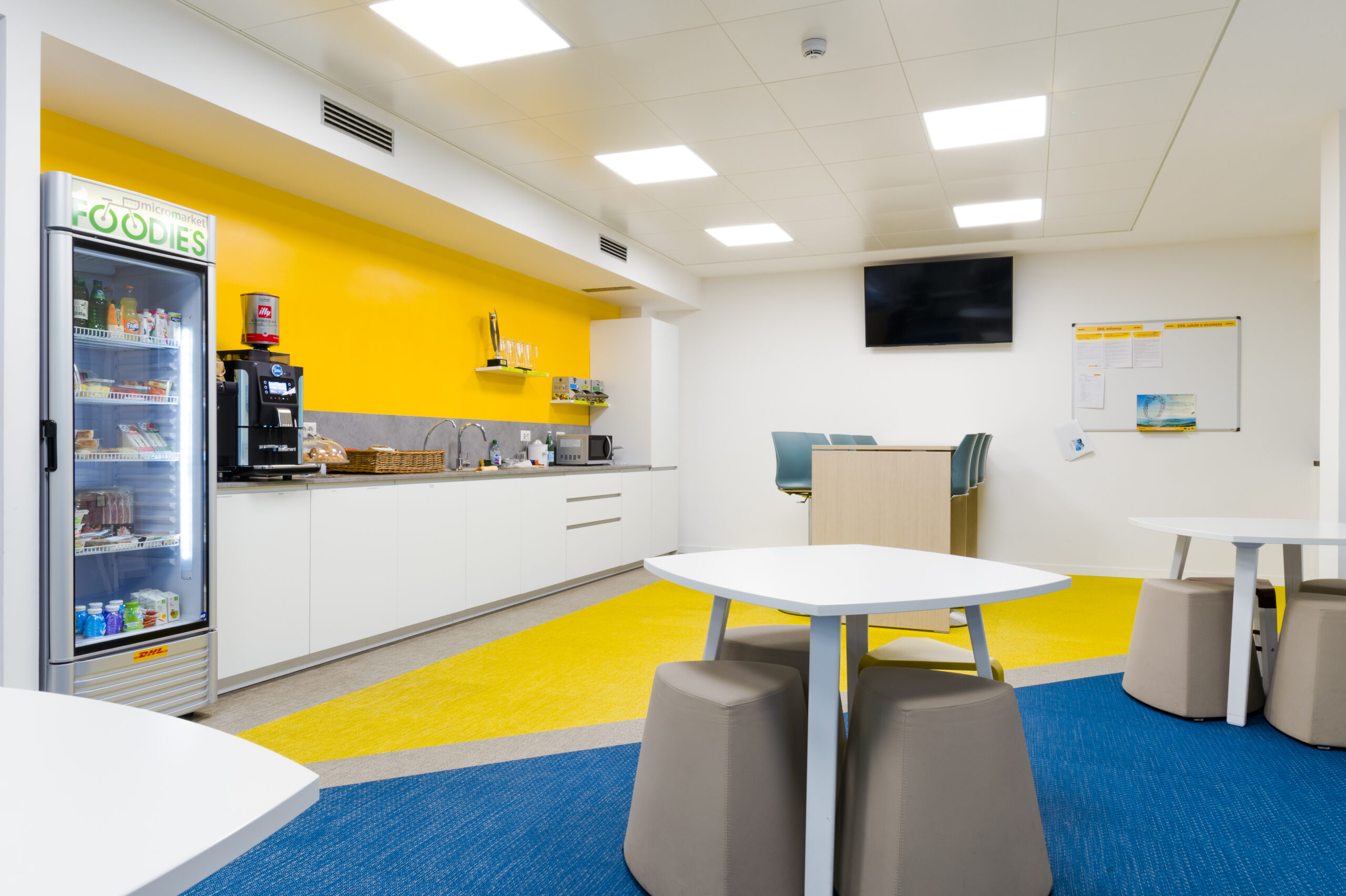
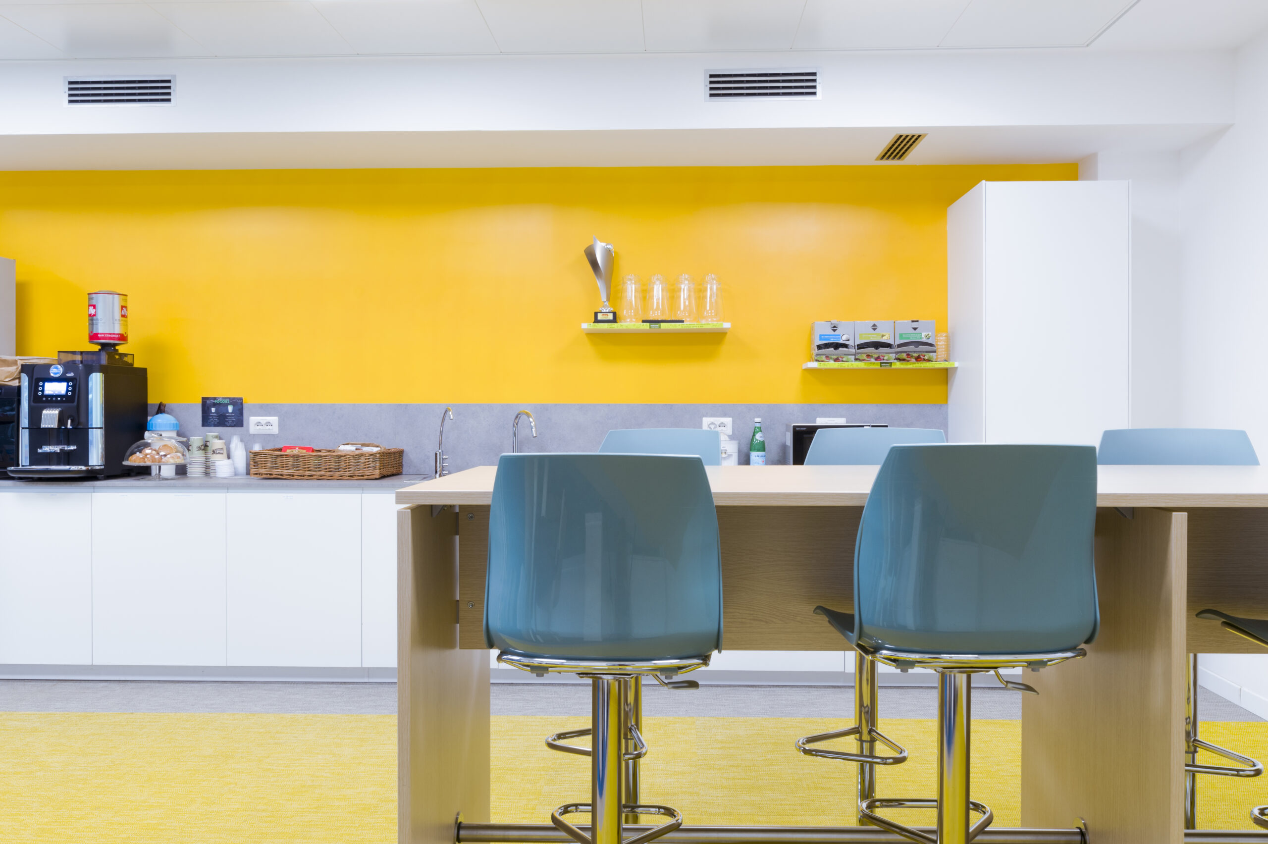
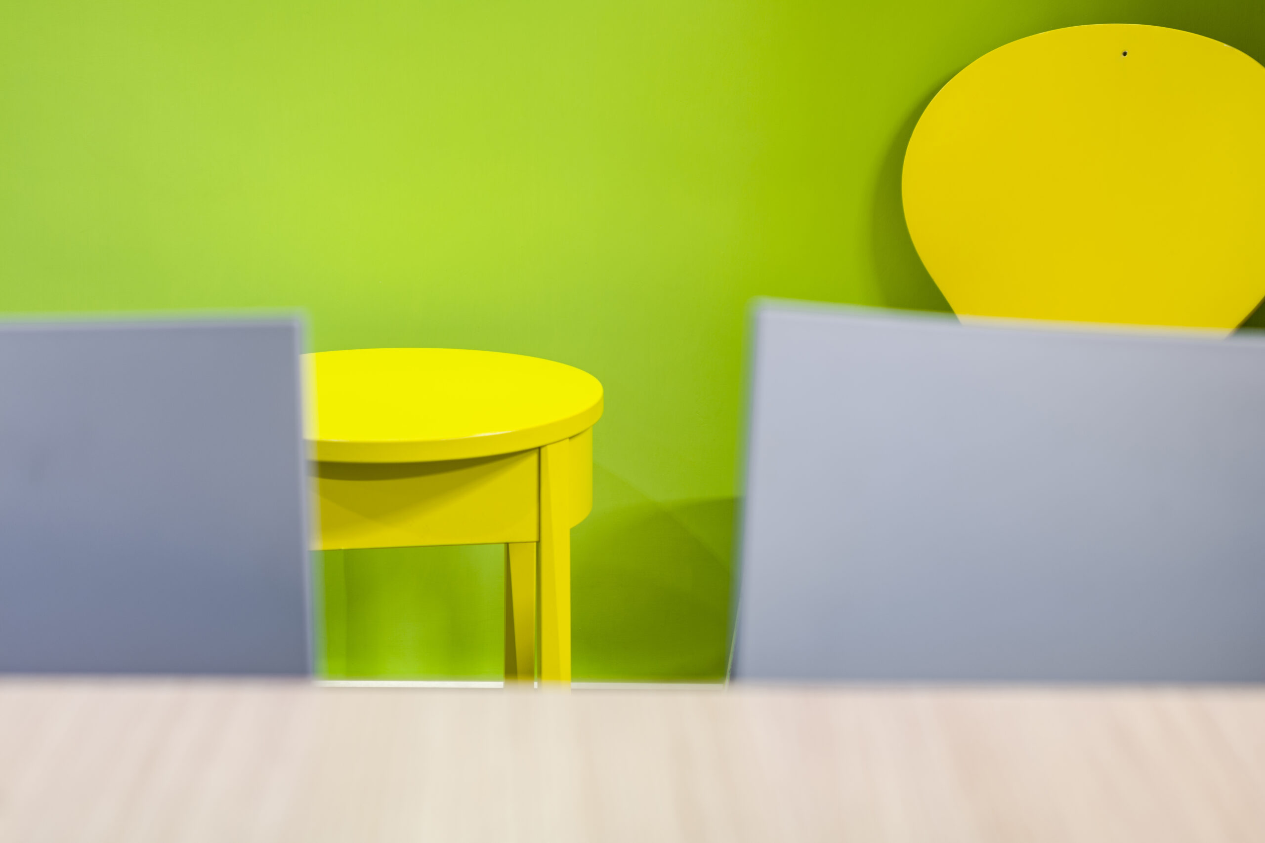
Yellow: it stimulates concentration, learning and sociability, representing vivacity and lightness. This colour is therefore a must in working environments where creativity and dynamism are required! Like our project "Happy break"
Yellow: it stimulates concentration, learning and sociability, representing vivacity and lightness. This colour is therefore a must in working environments where creativity and dynamism are required! Like our project "Happy break"
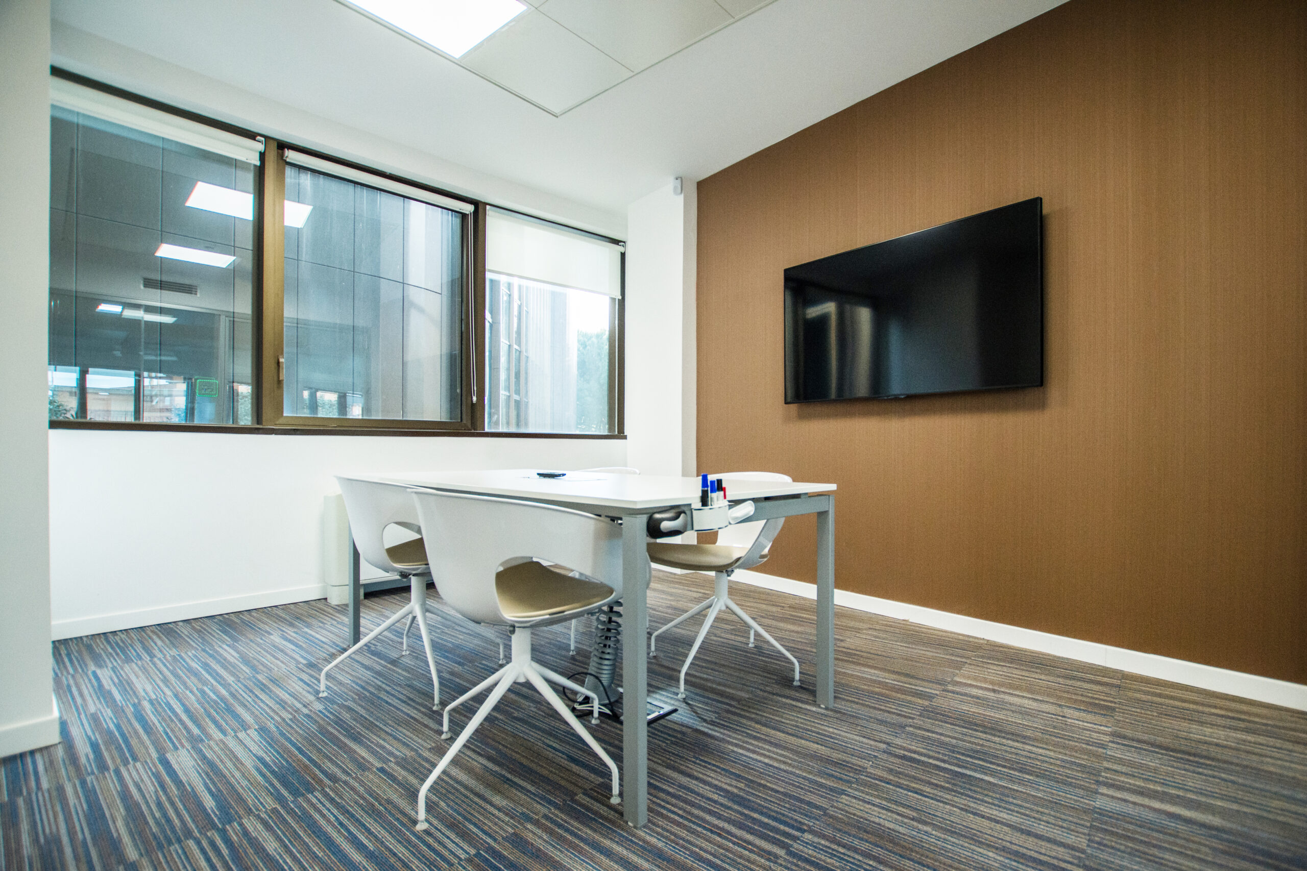
Brown: it conveys simplicity, like beige or ochre, giving stability and tradition, durability and warmth, at the same time.
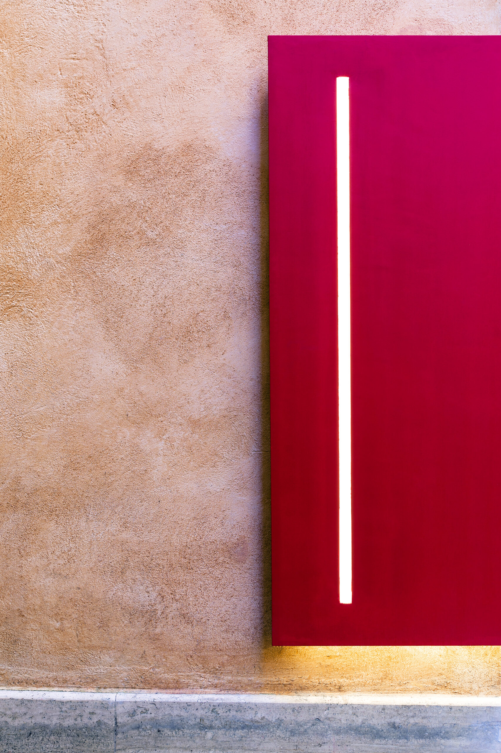
Red: it is the colour of energy par excellence, it is therefore very stimulating. Precisely for this reason it should be used sparingly in both working and living environments, to prevent the environment from becoming excessively exciting. Look our project "The red ribbon"
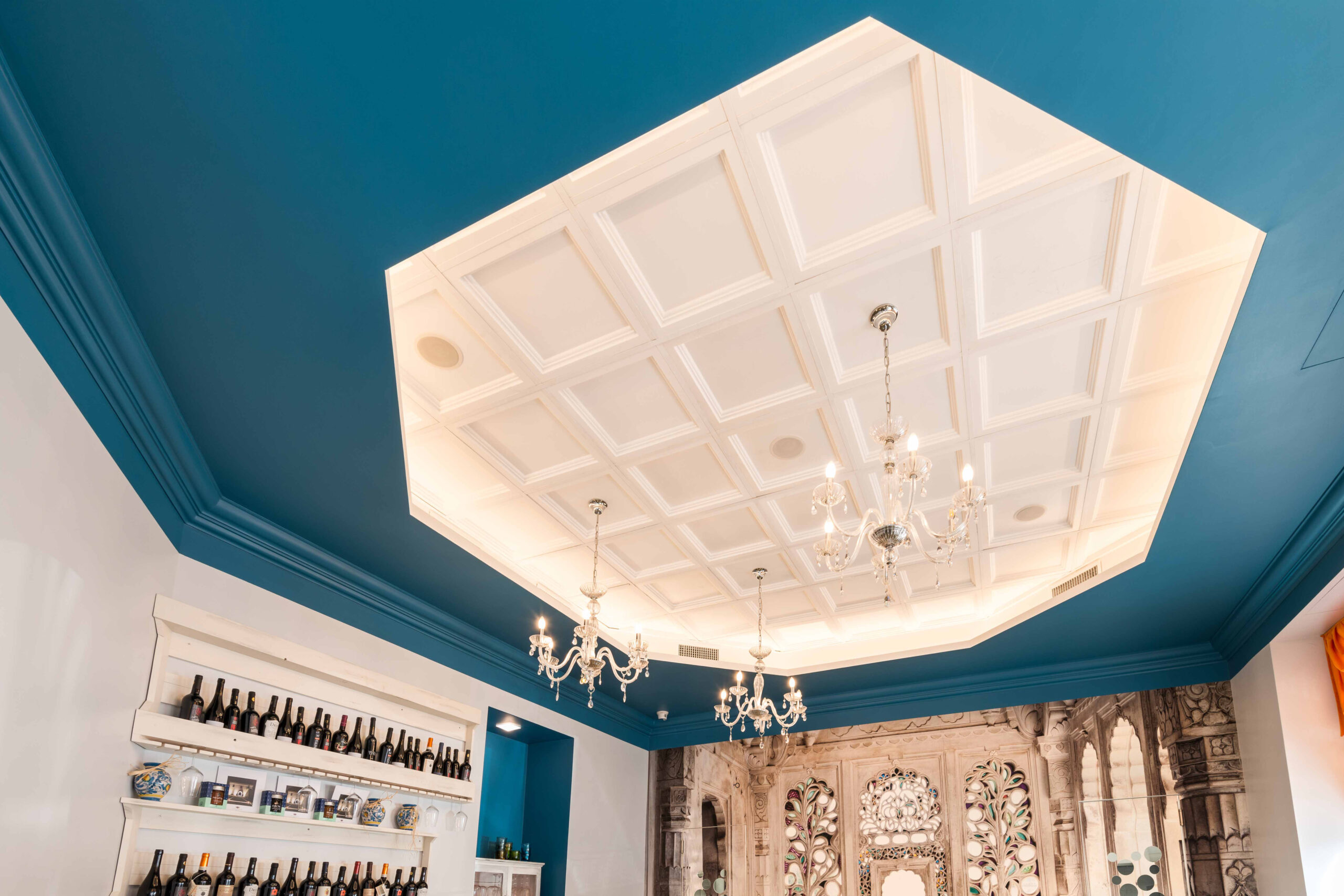
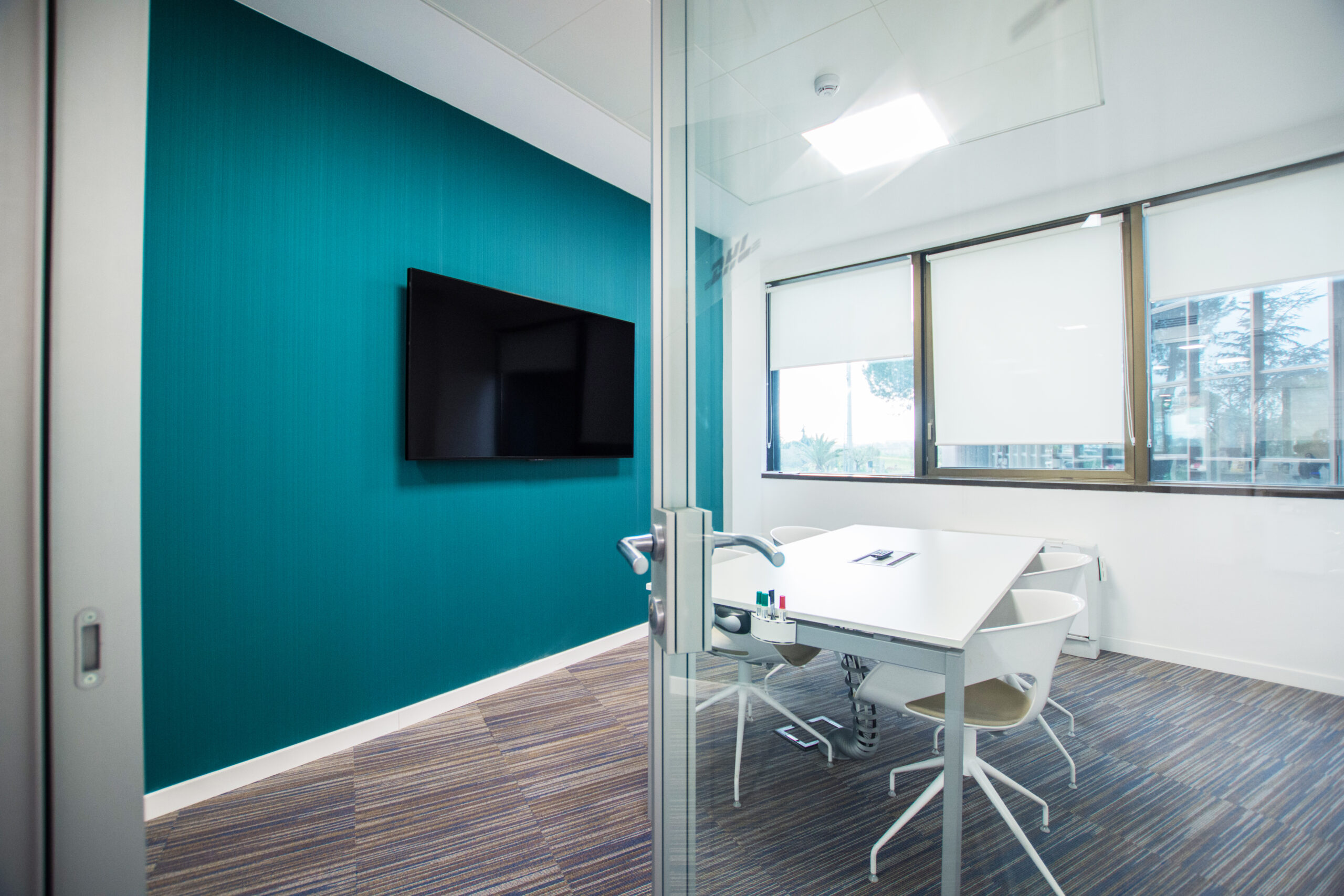
Blue: it is essential at home and at work. It transmits great calmness even in its most delicate shades; it is therefore useful for relieving stress and creating a harmonious environment, as well as stimulating the concentration. However, it should be avoided in living rooms because of its too calming shades. Is also good for restaurants, like "Pure south in Rome"
Green: it is the colour of nature and represents the calmness, like the blue. If is often used in sleeping areas at home to favour relaxation, and in working environments to promote social relations and friendship.
Orange: it is the colour of joy, happiness, and growth. It gives a magical balance when combined with wood.
Purple: it is a powerful colour, that recalls intelligence and devotion (in fact, it is often used in ecclesiastical environments). Its lighter shades recall sensuality and sweetness.
Purple: it is a powerful colour, that recalls intelligence and devotion (in fact, it is often used in ecclesiastical environments). Its lighter shades recall sensuality and sweetness.
White: the colour that everyone likes, which gives cleanliness and brightness to the environments; however, its excessive use could result in too cold spaces, therefore unwelcoming. White is also color of purity, like the art of dance; look our project "Academy of arts"
The use of colour is therefore a wide theme, the real difficulty of which is to understand it in its full complexity. Colour is a part of our world, it embraces our environments and days, indirectly modulating our behaviours and stimulating our perceptions.
Colour for architecture has the same value of colour for a painting: the architecture becomes the strength of our past, present and future experiences as a canvas that creates emotions and sensations.
Colour for architecture has the same value of colour for a painting: the architecture becomes the strength of our past, present and future experiences as a canvas that creates emotions and sensations.


