Yellow inserts
Location: Rome
Area: 400 Smq
Client: Asset Management Company
Project time: 2017
Each Company needs its own coordinated image, given by the set of graphic-visual elements that directly and harmoniously convey the Company's portrait, almost like a Company's dress, making it recognisable to everybody.
It is important to transmit this image also from an architectural point of view; various kinds of elements and pondered interventions, on the basis of the message to spread, make the Company's image unique.
We developed this concept for a property that houses different Companies, which wished to give a visual recognition to both indoor and outdoor areas of the building.


The areas of the main entrance, the reception hall and the lift landings have allowed us to create a visual / architectural fil rouge of the spaces, giving a particular uniqueness to all the environments.
To achieve that we have decided to use the colour as leitmotif of this design; the colour we chose is yellow that, thanks to its emotional feeling, has made the environments unique.
Yellow has been chosen also for its warm tone which gives rise to freedom, movement, and vitality, creates a cheerful and welcoming atmosphere in addition to conceive those characterising elements of a Company.
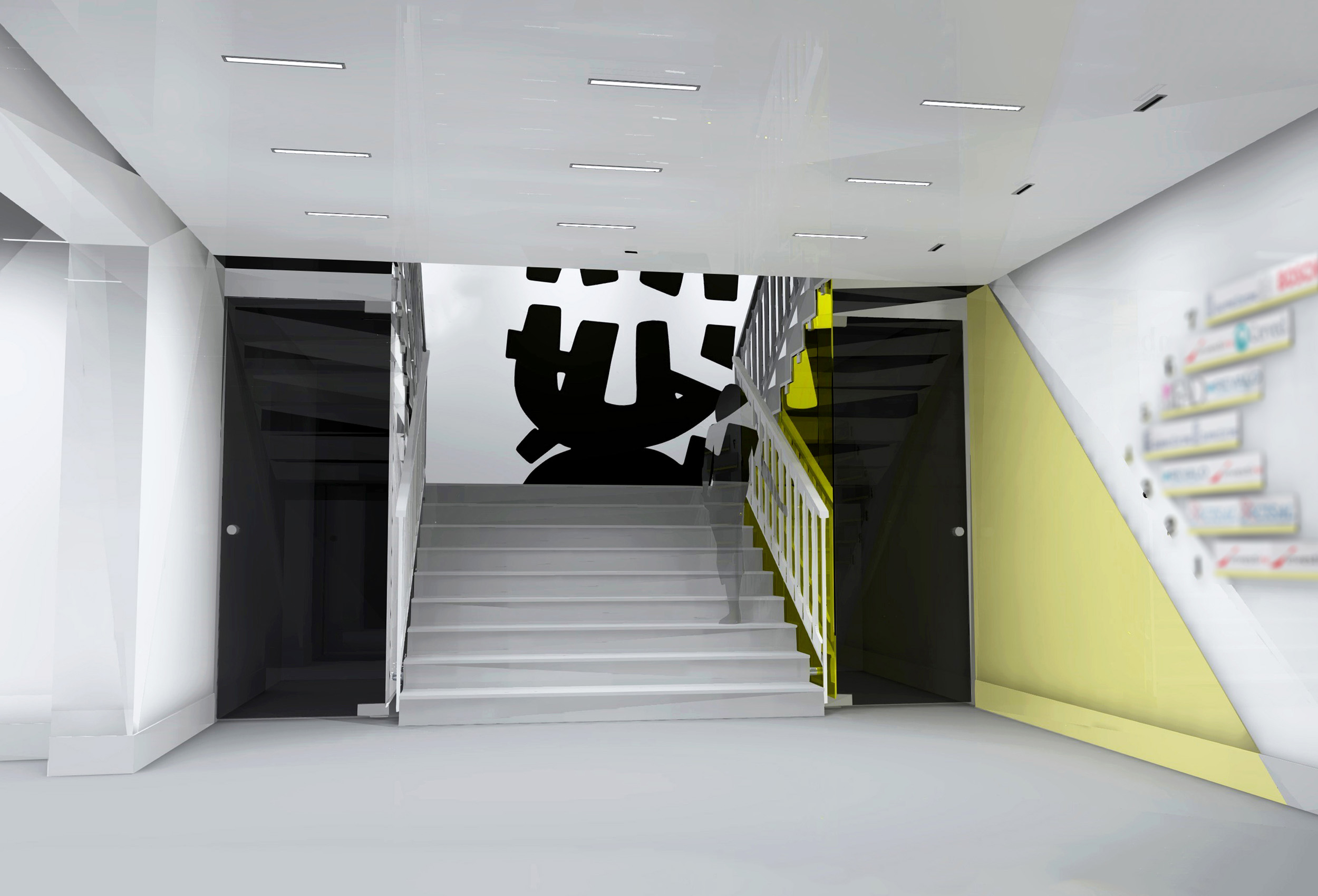
The entrance to the building is set back from the facade and is characterized by pillars covered with yellow metal casings,
arranged in a play of solids and voids resulting in a great dynamism and contemporaneity of the final appearance. To underline the continuity, the yellow metal casings were also used to accommodate the signs of the different Companies located into the building.
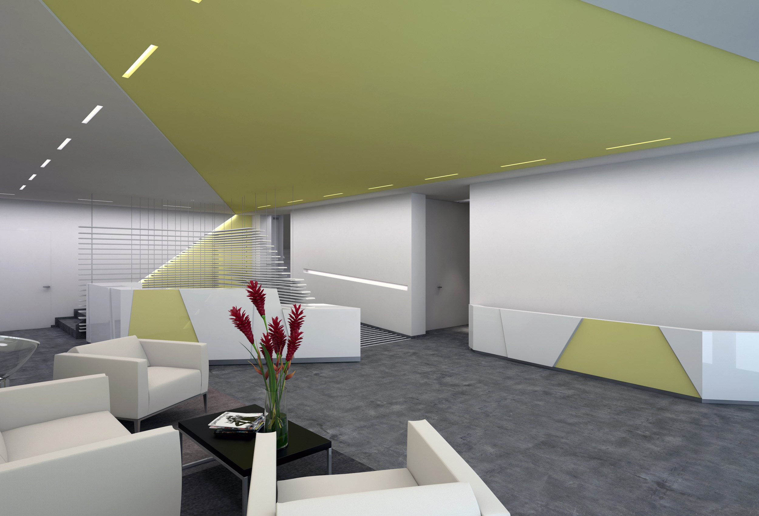
Once inside you are welcomed by the main entrance with a waiting room on the left; the reception hall, from which the lift landings are accessible, is located at the end of the main entrance.
The reception is characterized by a rectangular space; two of its sides are occupied by a corner desk with a geometric coating, whose diagonal lines pattern enriches and defines some portions characterised by the same yellow tone of the entire project.


The other two sides consist of two wooden and metal structures that create a visual protection grid of the reception, and which also define the walkway space for users.
The rigid and diagonal structure of the desk creates a visual movement, and its shape directs the flow of users in the building.
On the other hand, its external appearance expands throughout the whole environment; the diagonal lines rise up from the ground up to the false ceiling, characterised by a predominant yellow geometry spaced out by linear lighting elements, to underline the rigid geometries on which the entire concept is based.
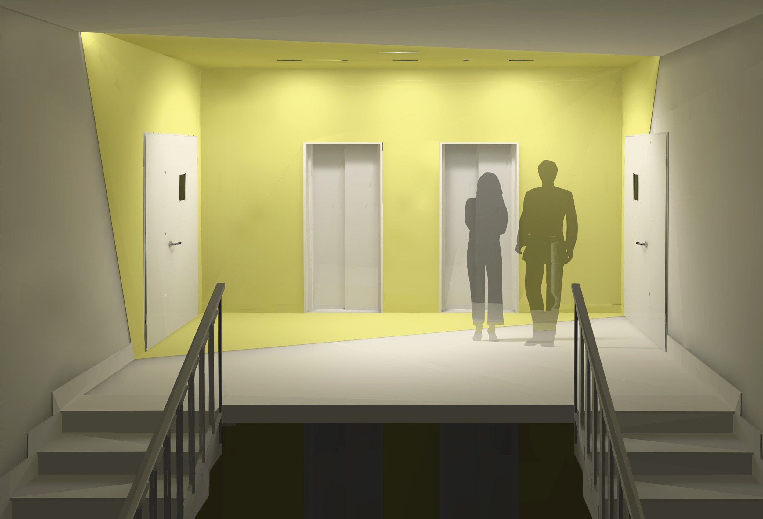
We have also designed a restyling of the lift landings based on two design hypotheses:
the first one provided for diagonal cuts and a predominance of the yellow colour on the walls, ceiling, and floor, thus creating a delicate game which would have also incorporated the lateral accesses to the different offices.
The second option involved, in addition, the insertion of a Corten panel cladding on the lifts wall, thus creating a greater visual contrast.
