Color wayfinding
Location: Rome
Area: 700 Smq
Cliente: Asset Management Company
Project time: 2023
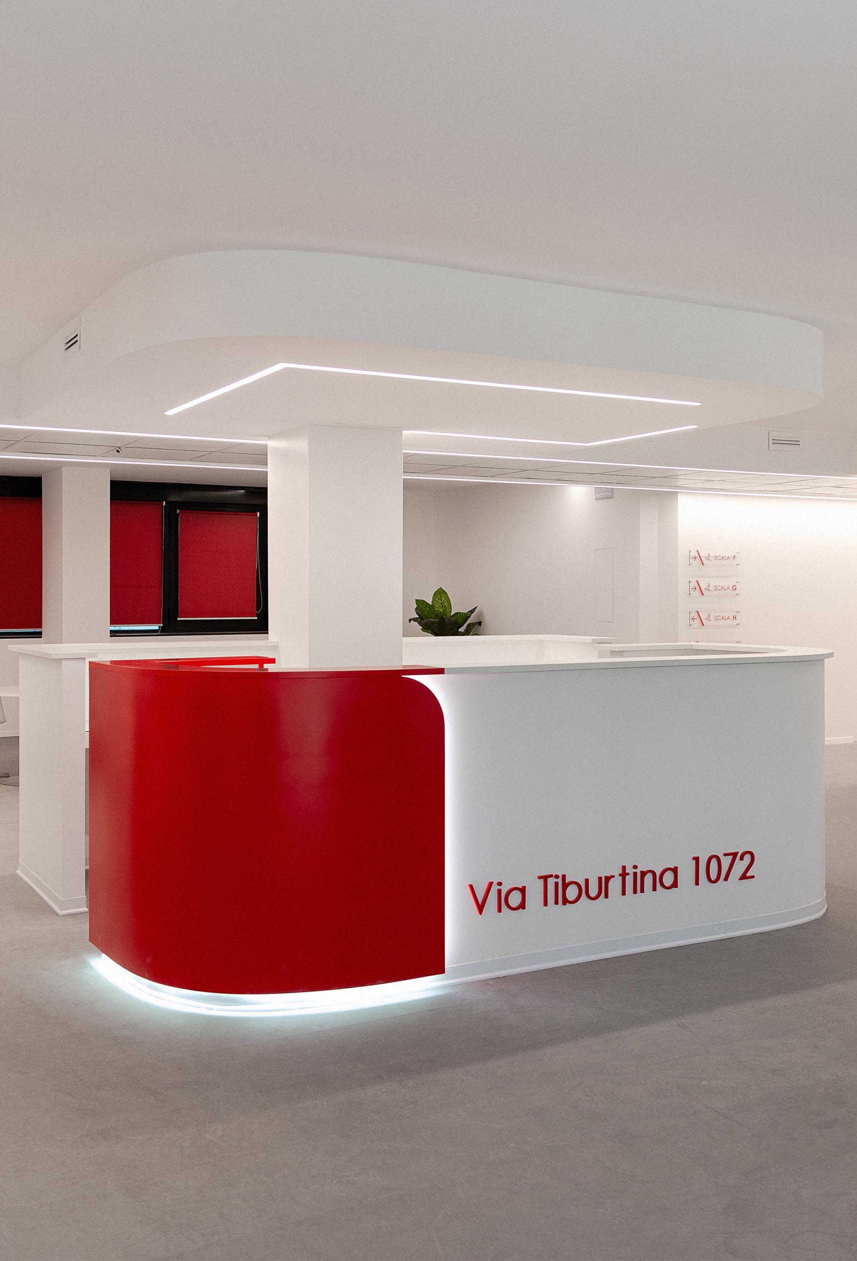
We chose red, a vibrant, energetic, passionate and highly visible colour, to enhance a large office complex on the outskirts of Rome (if you are intrigued, have a look at the description of the sister project in the projects section under “Multicolor”).
Colour in architecture provides a greater understanding of the world built around us, helps to make a project extremely visible and recognisable, and so becomes an identifying feature of it.
We chose red, a vibrant, energetic, passionate and highly visible colour, to enhance a large office complex on the outskirts of Rome (if you are intrigued, have a look at the description of the sister project in the projects section under “Multicolor”).
We were responsible for the refurbishment of the large communal areas, including connecting spaces and reception areas, for which we relied on colour to emphasise the project.
Red for the reception desk and blinds, light blue, orange and emerald green for wayfinding on floor landings, the colours live, interact and help users to find key areas, routes and floor levels.
Interventions of this kind are particularly useful and functional in large spaces, where coloured inlays create a guidance system for users and instil a relationship of trust and serenity when using the building.


